Visualization Practice Across Tools
Notes from a daily visualization practice focused on matching chart forms, datasets, and implementation tools.
Daily visualization practice has been a useful way for me to test chart forms, learn unfamiliar tools, and stay close to the craft of visual explanation. I treated each prompt as a small design question: what is the comparison, what should the reader notice first, and which tool gives me the right balance of speed and control?
The exercises below were less about producing a final polished product and more about building judgment across different visualization stacks, from R and ggplot to Flourish, D3.js, SVG, and Three.js.
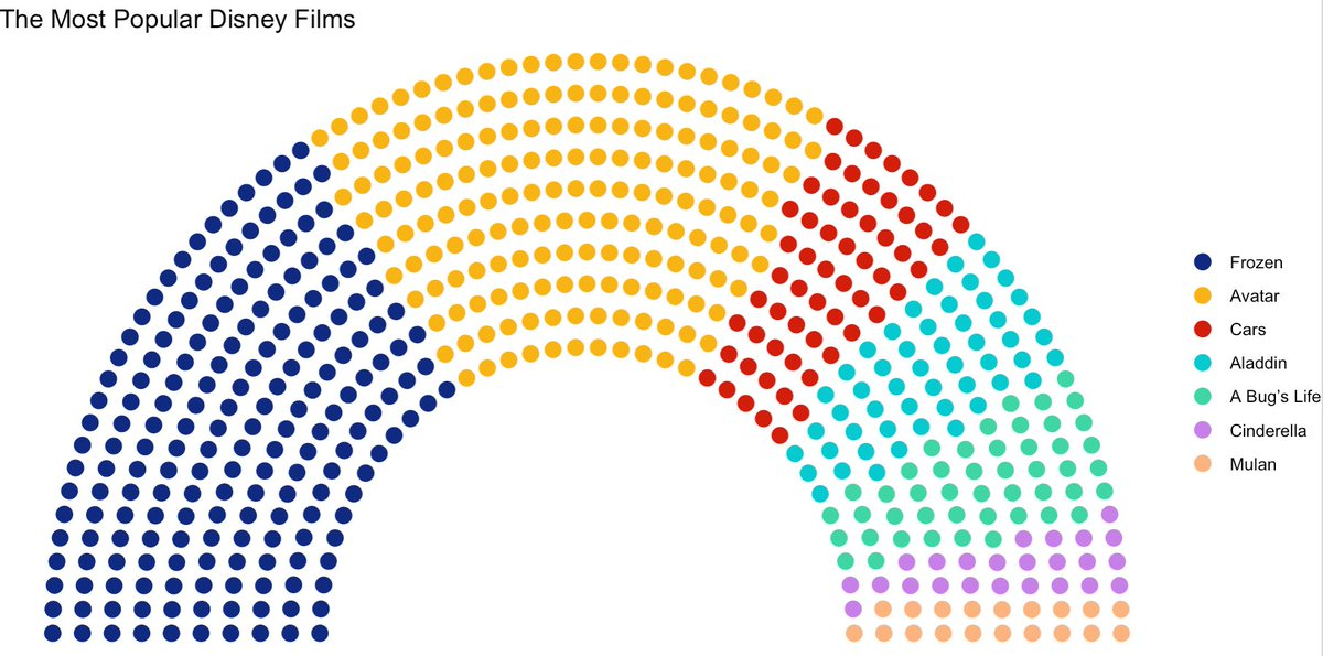
Day 1: Part-to-whole, popular Disney films
I started with a light subject because I have always enjoyed Disney films, but the chart choice was still intentional. A parliament chart works well for part-to-whole comparisons where the visual mass of each category matters more than exact ranking.
I built this in R with ggplot. Coming from a JavaScript background, I found R’s grammar-of-graphics model refreshing because it encourages you to think declaratively: data, mapping, geometry, and theme each have a clear role.
Day 5: Slope, U.S. party affiliation by state
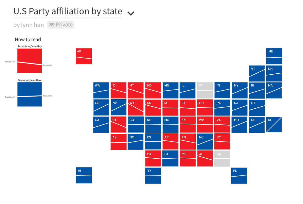
Traditional slope charts can become hard to scan when many categories have similar values. For this prompt, I experimented with a geo-slope chart: each state keeps a familiar map-like position, while the internal slope line shows how Republican and Democratic affiliation compare.
I used Flourish for fast layout exploration, then D3.js and SVG for custom structure and presentation. The geographic arrangement makes the comparison easier to navigate because readers can use spatial memory instead of parsing one long list of nearly parallel lines.
Day 6: Data day, annual investment in AI
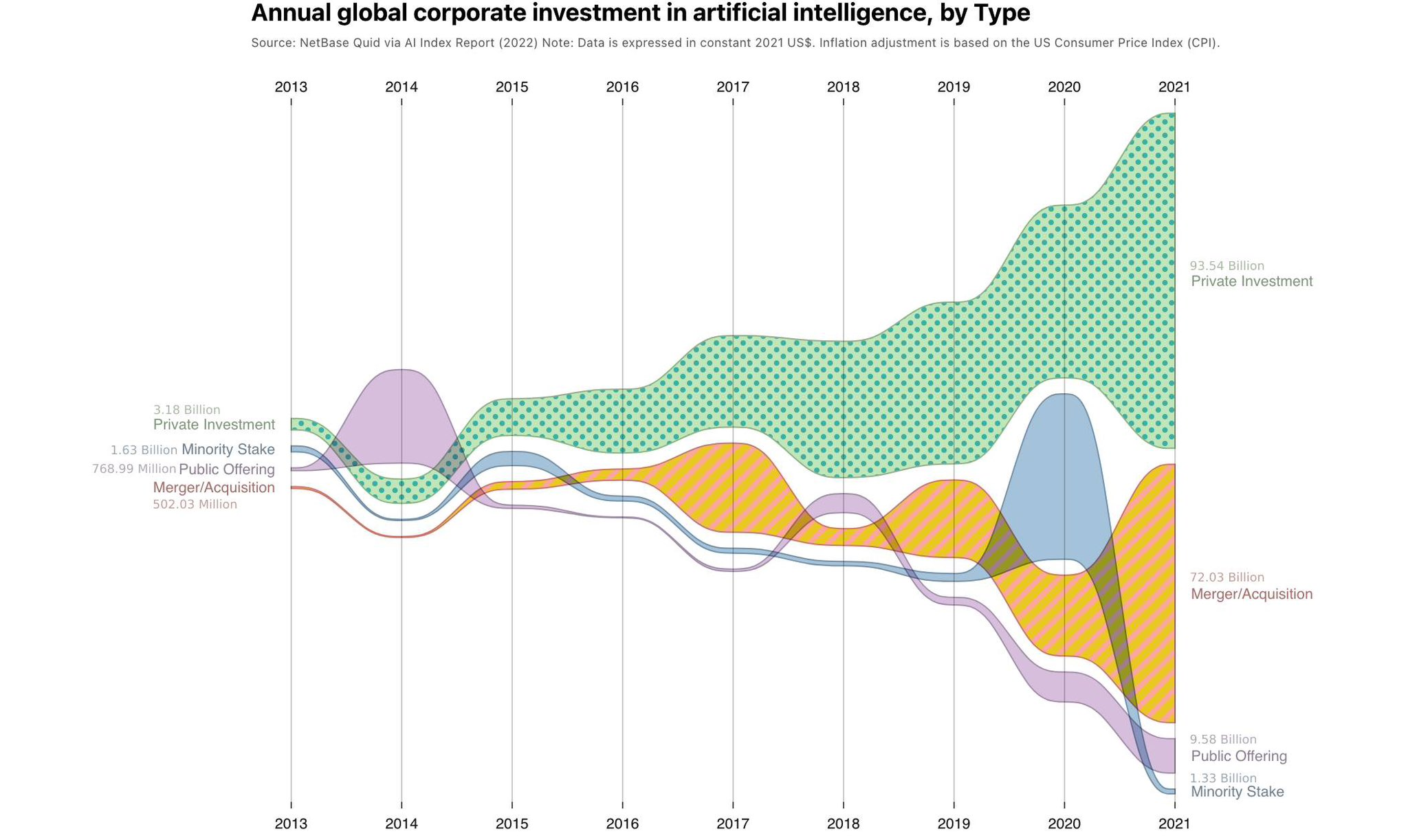
This exercise came from curiosity about how investment followed the rapid progress of modern AI systems. I used the OWID data-day prompt as an opportunity to look at annual global corporate investment in artificial intelligence by funding type.
The streamgraph format emphasizes both growth and changing composition over time. It is not the most compact chart for exact lookup, but it works well when the goal is to show momentum, category flow, and the scale difference between private investment, mergers and acquisitions, public offerings, and minority stakes.
Day 7: Hazards, the impact of influenza
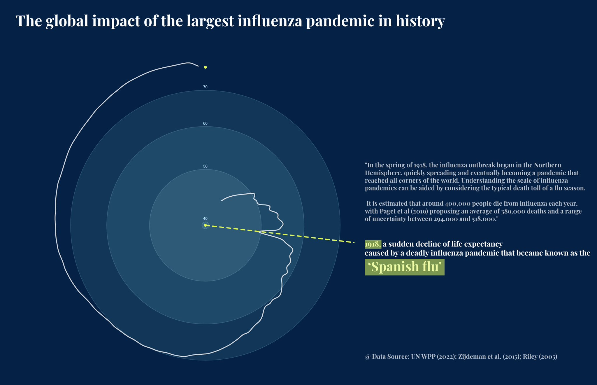
After conversations with coworkers about pandemics, I looked into the 1918 influenza pandemic and its effect on global life expectancy. The surprising part was not only the scale of mortality, but how sharply it appeared in the population-level trend.
For this piece, I prioritized narrative annotation over chart density. The radial form creates a strong visual break around the sudden decline, while the text block gives enough context for the reader to understand why that point matters.
Day 13: Pop culture, influence around Pop Art
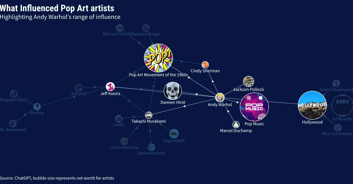
For the pop culture prompt, I wanted to show influence as a relationship instead of a ranked list. I used a network visualization centered on Andy Warhol, with nearby nodes representing artists, movements, media, and cultural references connected to Pop Art.
The network layout helps communicate range: fine art, commercial imagery, music, Hollywood, and contemporary artists all sit in the same field of influence. This format also made room for visual hierarchy through node size and placement.
Day 14: Geometry, 3D, and the Nobel Prize
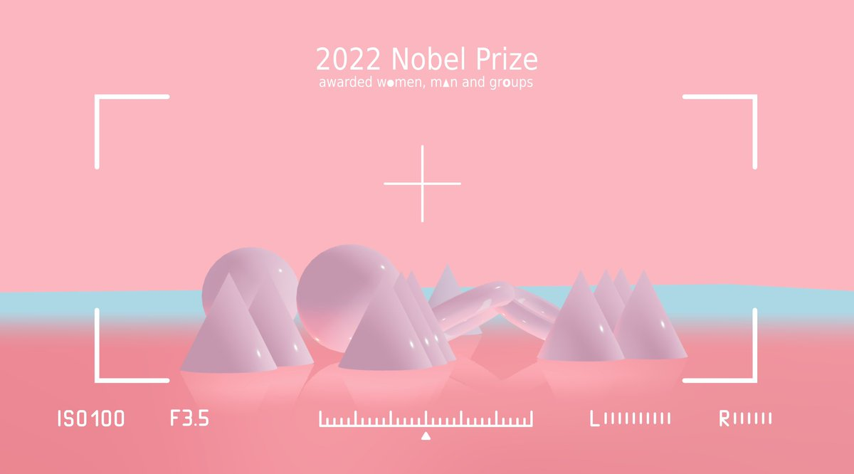
I am drawn to geometric forms and 3D work on the web, so this prompt was a natural place to experiment with Three.js. I used the proportion of 2022 Nobel Prize winners awarded to women as the data framing, then built a stylized 3D scene around shape, material, lighting, and camera composition.
Three.js is powerful because the visualization problem becomes spatial. Instead of only choosing marks on a flat plane, you also make decisions about depth, perspective, surface, and motion. That makes it especially useful for exploratory visual language, even when the underlying data is simple.
Reflection
The main lesson from this practice was that tools shape how you think. R and ggplot encourage clean data-to-geometry mapping. Flourish supports fast editorial prototyping. D3.js and SVG give detailed control over custom encodings. Three.js opens a spatial design space where composition and material become part of the message.
Across all of them, the core question stayed the same: what should the visualization make easier to understand?