Prototyping the U.S. Key Market Report Dashboard (IMDB)
Turning survey feedback into table and card prototypes for a React/D3 housing-market reporting dashboard.
The U.S. Key Market Report Dashboard (IMDB) was designed as a React/D3.js housing-market tool for reporters, researchers, and real-estate stakeholders. The production dashboard integrated Bridge API and Firebase data, with performance work that improved visualization load speed by 30%.
This note focuses on the prototyping result: how early user feedback shaped the metric priorities, page structure, and comparison workflow.
Survey Signal
From 9 survey responses, two needs were unanimous: access to core market data and comparison between metros. Users cared most about metrics that explain both price pressure and supply movement:
- ZHVI
- ZRI
- Inventory
- Listings with price cut
- Housing affordability across mortgage and rental contexts
For future functionality, respondents also prioritized comparing metrics across multiple metros. Interactive geographic context and time-range filtering were secondary, but still important enough to shape the Trends view.
Key Functions
The prototype split the experience into two primary modes.
The first mode is listing stats: a dense overview table for scanning market rank, headline metrics, and year-over-year movement. The second mode is compare: a card-based trends view for selecting multiple metros and reading pattern changes side by side.
That separation kept the Overview page optimized for precision and the Trends page optimized for comparison.
Overview: Table First
The table layout works well when the user needs exact values, rank, and compact comparison across many metros. ZHVI, ZRI, inventory, and annual-change fields sit in predictable columns, while an expanded row gives space for supporting metrics and small trend charts.
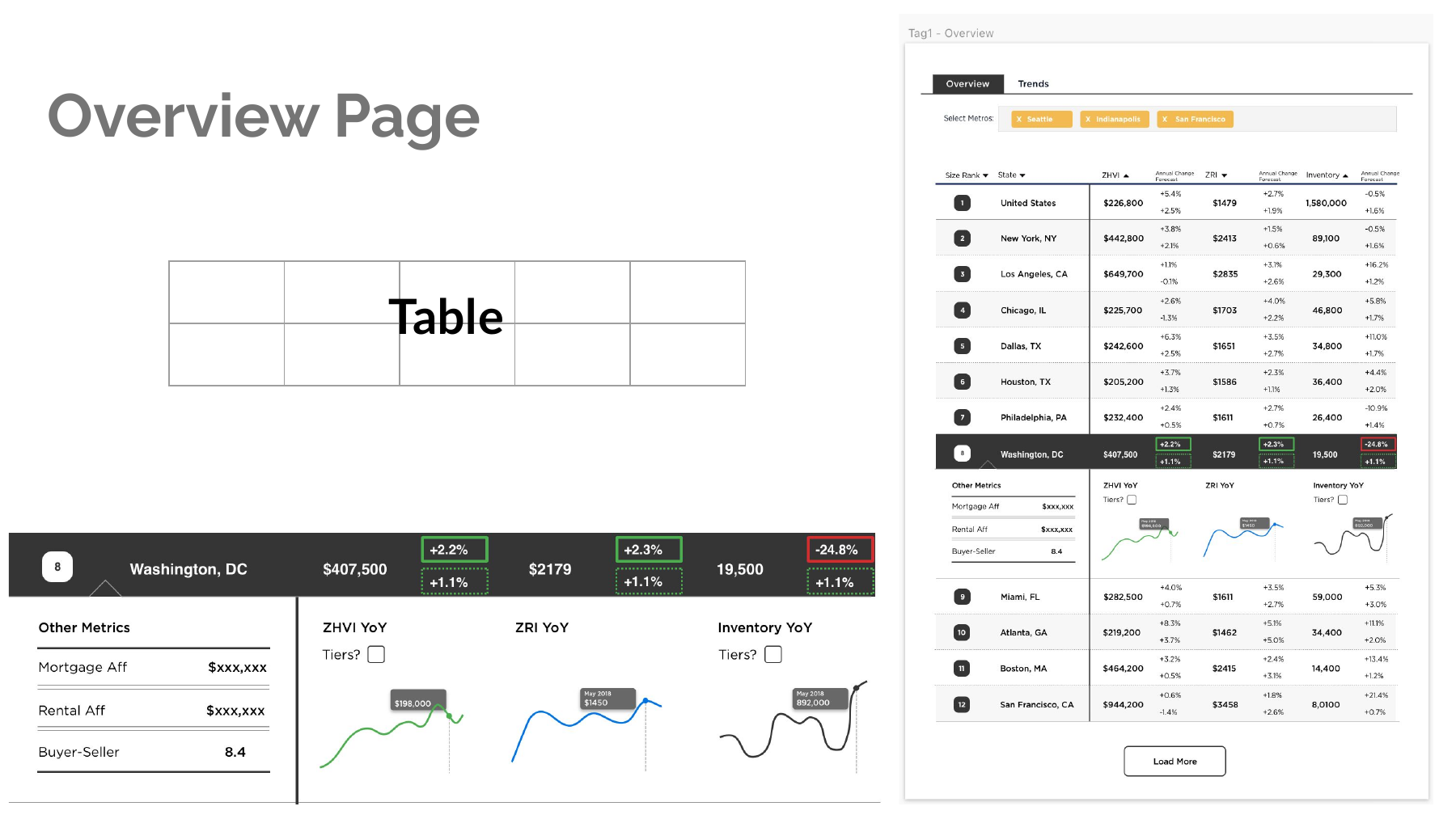
The main design decision was to keep the table as the anchor instead of turning every metric into a chart. For an audience making reporting or research decisions, the fastest path is often: scan the ranked table, identify an outlier, then open the row for supporting context.
Trends: Cards For Comparison
The card layout gives each selected metro a compact, repeatable unit: location name, active metric, and a small trend line. This makes the page easier to scan when the question shifts from “which market ranks highest?” to “how are these markets moving differently?”
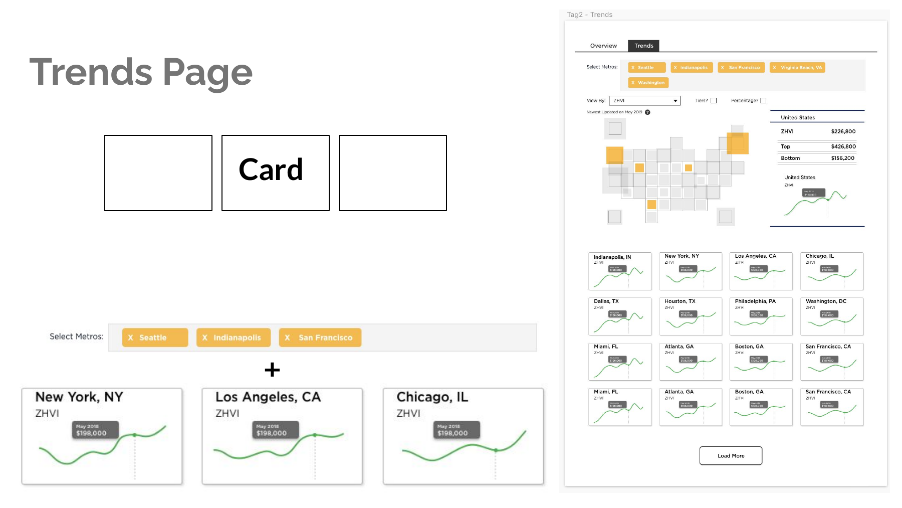
The Trends view also makes room for a map-like selector and a persistent selected-metro summary. That matters because housing-market comparisons are inherently geographic: users need to understand both the local signal and the surrounding market context.
Design Questions
I would treat the prototype as a decision artifact rather than a final interface. The next round of testing should ask:
- How should a user move from a market ranking to the evidence behind that ranking?
- Which interactions make metro comparison feel lightweight instead of filter-heavy?
- What should be visible by default, and what should stay behind controls?
- If I were redesigning this for daily newsroom use, what would I simplify first?
The larger lesson is that dashboard design is not only about adding more metrics. It is about deciding which metrics deserve immediate attention, which comparisons need structure, and where visualization can reduce the cognitive load of repeated analysis.